
Case Study: Zirza
Case Study
Deep within the mysterious galaxies exists a band of 4 aliens…exploring the cosmos and sharing their sound and love for music! Their next destination? Earth! My thesis project is a fictional virtual band called Zirza. Now, what is a ‘virtual band’ in the first place? A virtual band is just like any other band you might think of, except its members are animated or virtual characters. The band may be fictional, but the music and production are real and are usually made by real musicians and producers. Think of artists like the Gorillaz or even Hatsune Miku. While the characters are fictional, everything else from the music to the merchandise are all very real! Zirza follows this same concept. This band is composed of 4 aliens, each with their own unique design, instrument and personality.

Introduction

Project Summary

My goal for this project was to show both my design and illustration skills. A project like a fictional band allows me to demonstrate character design, music packaging design, typography, and merchandising. I hope for this project to be a strong piece in my portfolio and show my range as a visual storyteller, designer, and illustrator.
This project is composed of the character design, album package (outer sleeve front, inner gatefold, inner sleeve, vinyl label, and vinyl), tour poster, and extra merchandise. I chose to pursue this route for my senior thesis because I have a deep love for music and illustrating, so combining the two seemed like the best way to show off my passion and my skills.
Project Process
Character Design
When I initially had my idea for a fictional band, they weren’t aliens at all! I had actually gone through a few different ideas, like making them different monsters or making them anthropomorphic animal people. I only came up with the alien concept while jotting down ideas, and I wrote down “space themed?” inside my sketchbook and started to brainstorm shortly after. After racking my mind over my sketchbook for a while, the alien concept stuck in my head, and I had already started to mindlessly doodle the beginnings of Zirza without even realizing it. Designing the characters themselves was the first big hurdle, trying to develop members that were interesting enough individually while also looking cohesive enough to be a group. Before I had any solid character idea to present, I gathered some inspiration and saw how aliens are usually represented in the media. I wasn’t really interested in making the standard big-headed green martian we are used to seeing. When I thought of the fictional band idea from the beginning, I already knew that I wanted each member to be a unique individual. I drew a lot of inspiration from Space Channel 5, Monster High, Bratz, Retro futurism, and Retro fashion when brainstorming.


Meet the Band +
Meet the Band +
Aeqali
(Eye-Kah-Lee) The lead singer and the first character I designed. Aeqali is inspired by fish, and some of her characteristics include pupil-less eyes, tentacle-like hair, webbed hands, and green skin. Out of all the members, she is the most human-like, which I thought would make sense for the leader of the group. Her personality can be described as hyper-extroverted, a little mean, a little vain, and a big tease. Since she is a distant relative of what we know are fish, she does a lot better in humid environments and has no shame in bringing a spray bottle with her if the air is too dry.
Purba
(Per-Bah) The bassist and a cyclops alien. Purba is slightly short and fuller-figured than Aeqali. One of her accessories is a star-shaped helmet that purposefully nestles her hair and her antennae inside it. She only has 3 fingers on each hand, and her bass mimics a star shape just like her helmet. Purba is a lot more shy and reserved than Aeqali, but just as curious about the galaxy and what the universe has to offer. She’s a bit of a germaphobe and feels like Earth’s atmosphere is too polluted, so she wears her helmet only half the time when she feels like she needs it.
Kaltok
(Kahl-Tok) The drummer and the character that went through the most iterations. I knew I wanted a masculine-looking member in the band, and I originally was holding onto the idea of a weirdly shaped/ exaggerated head, but that idea quickly fell apart, and I started to play around with extra/ missing limbs instead. I settled on 4 arms since it complemented his role as a drummer. Kaltok’s design is loosely influenced by reptiles, more specifically bearded dragons. The spikes on his head are part of his body and not just a fun fashion statement; however, they help his image as an intergalactic space-punk. He gets cold easily but likes to show off his arms, so he wears a sleeveless shirt most of the time. His home planet has a greater gravitational pull than Earth, so he often misjudges his strength and breaks his drumsticks.
Oorvos
(Oar-Vose) The keyboardist and the last member I designed. Oorvos almost didn’t exist since his necessity in the band was up in the air from day one. I wanted to make a blobby, genderless character of some kind that was a bit wacky. The initial concept of Oorvos felt more like a monster than it did an alien. For his final design, I imagined he was a slime alien that uses his suit as a means to have a more stable physical body. His sleeves are the only part of his suit left open, so he can freely use his slime abilities through them. He plays a hovering 360 keyboard. Oorvos is fully nonverbal, and his age and origin are unknown to the other members. Even though he can’t communicate verbally, you can still find him trying to communicate by manipulating his slime body. He has a dry sense of humor, which shows off both his intelligence and simplicity. His hovering 360 keyboard was inspired by a photo I saw online of a real 360 piano keyboard called the PianoArc.
Logos
At the same time, I was also working on developing the official logo for the group. I wanted to have a goopy feel to the letters, and I started playing with letterforms in my sketchbook. For the logo mark, from the very beginning, I had this vision of a star-like goopy shape, and I liked it so much that it ended up influencing the final Zirza logo heavily. I have a love of doing hand-done type, and I thought this project would be the perfect opportunity to have some fun with that.


Album Package
I ran into many issues creating the plan for my album package because I kept coming up with imagery that I liked, but when I put it all together, it ended up clashing and conflicting. For the album package, I planned to focus on my concept of alien flora and fauna.


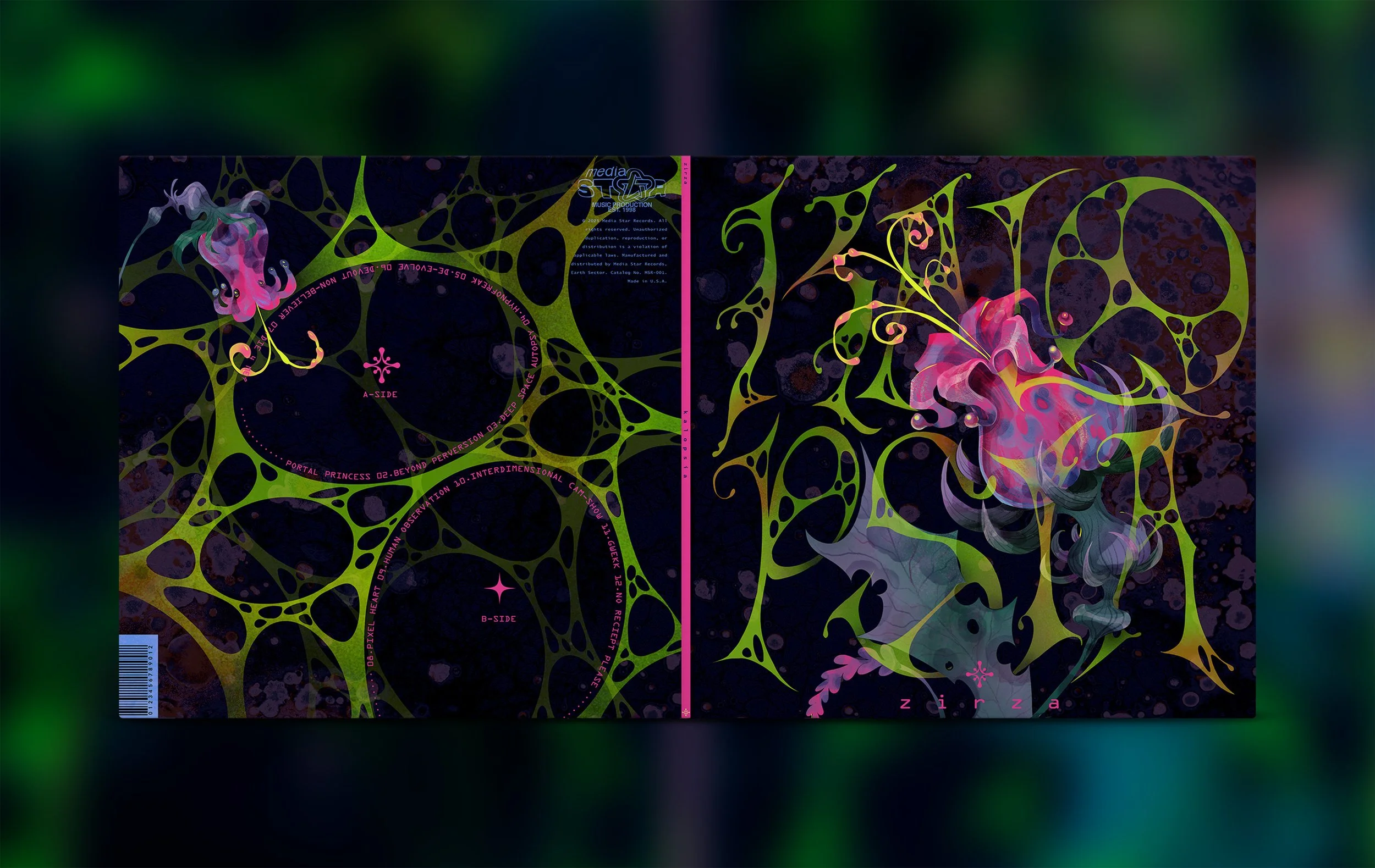
I was stuck on the idea of having a close-up view of an alien flower, but at this point, I still didn’t have an album title or tracklist. I played with the idea of having everything be some kind of alien gibberish or a combination of words. I spent a lot of time writing down words that I felt captured the energy I wanted for the album package. Honestly, none of that was working for me, so I continued my search for the perfect album title, and I fell into this web of looking up synonyms for words and then synonyms of those synonyms. Some album titles I initially came up with were Portal Princess, Hypnofreak, Out of Orbit, and Crash Landing, but none of these options gave the strange but curious vibe I was going for. I stumbled upon the word ‘kalopsia’ during my research, and it really struck me. The definition of kalopsia is the delusion of things appearing more beautiful than they are. I felt like the weird beauty of the alien flower I had sketched really resonated with that word. The front cover shows a close-up of a strange flower that is obstructed by the album title, KALOPSIA. And I felt like by showing glimpses of this alien home planet, I could show a story visually without being too direct, so that the viewer’s imagination could be provoked as well.
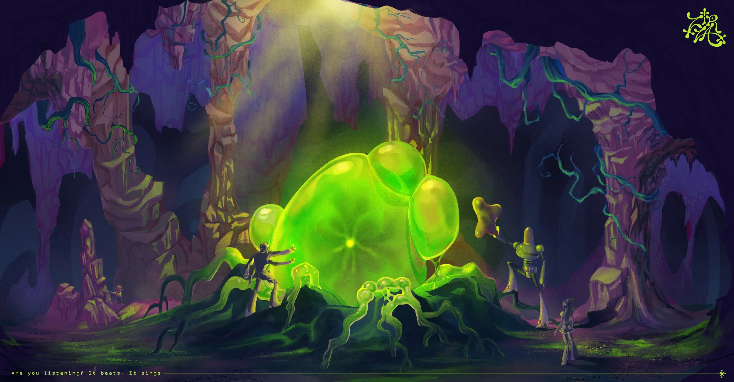
The original idea of the inner gatefold was a zoomed-out landscape of an alien home planet, but after seeking additional advice and criticism, I realized that the landscape that I had illustrated didn’t give off the aesthetic I was seeking. I wanted to add more of an odd and mysterious energy, so I redrew the inner gatefold to feature a different landscape that shows an odd underground cave with this large, glowing, egg-like form in the center. The inner sleeve features the album title again, and on the back is a group shot of the band members.
Tour Poster
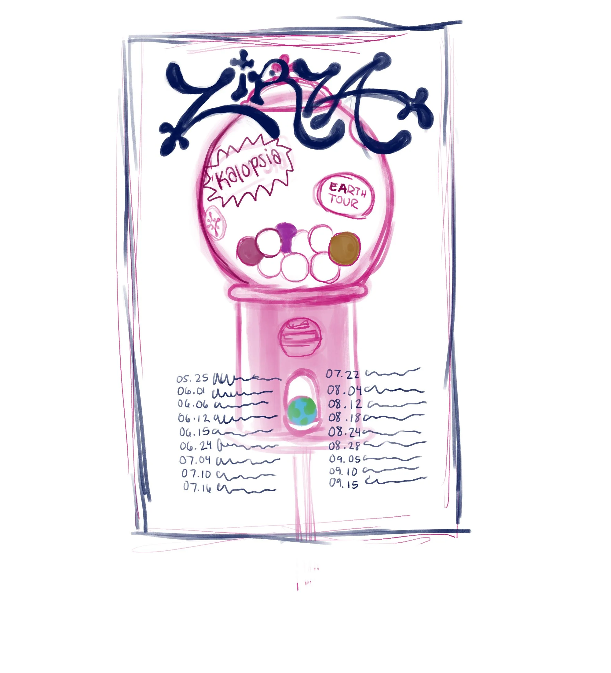
Instead of calling it ‘World Tour’, I thought it could be more fitting to call it ‘Earth Tour’, so from there, I started playing with earth imagery. I did some more research and sketching and decided to keep experimenting with the earth imagery and came up with the idea of the earth as a seed or a vessel, and I thought it would be smart to have the flower from the album front reappear on the tour poster to help bring everything together. If you look closer, you’ll notice that the album cover shows the flower at half-bloom, the album back shows it as a flower bud, and then the tour poster shows the flower in full bloom.


Extra Deliverables
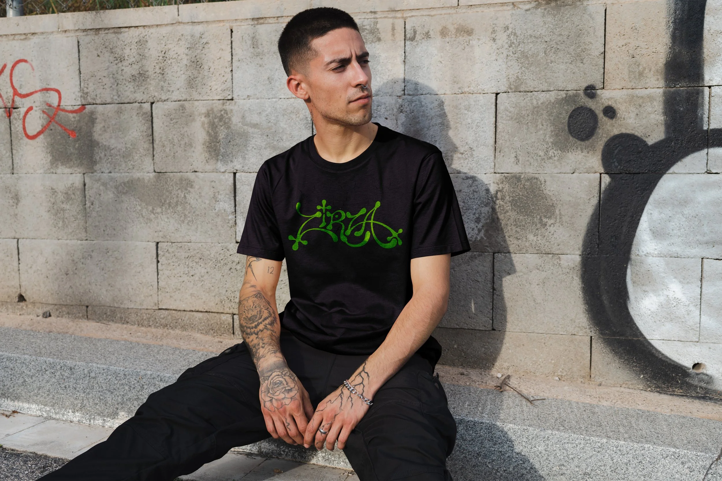
With a project so large and so fun, I knew that I wanted to make extra merchandise and branded items. My biggest goal was to design a billboard for the band, so it felt a little more real. I’m planning on designing more deliverables so stay tuned! Get it? Tune…like music tune….


Conclusion
Overall, I am pleased with the amount of work I was able to accomplish within that time. During the execution of this project, I feel like I was able to explore a lot of ideas that I wouldn’t normally have been able to from a regular class assignment, and that made it both exciting to work on and a bit overwhelming at times because there were endless avenues I could have pursued. Time was the biggest enemy of this project, so I had to monitor myself to make sure I wasn’t taking on too much at once. If I had more time, I would have loved to make extra deliverables like a lyric book, pins, a CD, guitar picks, and other apparel. With this project, I feel like I learned a lot about creating a cohesive visual story. Since this band was fictional from the start, I had to create my own foundation for them to start designing off of, and that might have been one of my largest hurdles because I had to ask myself who Zirza was as a band and also who they were as individuals. After the completion of this project, I feel like this is a concept I can continue to grow and explore. Especially in music packaging, I feel like there are so many directions you can go down. As long as the artistic vision is there, then anything is possible.